|
|
|||||||
|
|
|
|
|
|
|
|
|
|
|
|
|
|
|
|
|
|
|
The only way to ultimately achieve success in the financial markets is to buy low and sell high. For investors, the timespan between buying low and selling high can run over a decade at times. For speculators, buying low and selling high are separated by much less time, as little as days in some cases. But for both investors and speculators, in order to buy low and sell high two crucial questions must first be answered. What is low? What is high? These most-fundamental questions of trading are something we study without ceasing at Zeal. Our most successful approach to addressing these questions is profiled each issue in our Zeal Speculation Matrix.
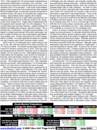
The Zeal Speculation Matrix can be found on Page 4 of each monthly issue of Zeal Intelligence and Page 1 of each weekly (or more often if market conditions warrant) issue of Zeal Speculator. You can click on either of the pages above to see the Matrix in its original context within sample issues. The purpose of this Matrix is to help investors and speculators understand when particular price levels are high or low relative to their recent historical context. If they are near relative extremes, they may be signaling a good trading opportunity for investors and/or speculators. The theory behind and use of the Zeal Speculation Matrix is explained here.
Relativity Trading Theory In order to determine if a price happens to be high or low, there must be something to compare it to. And this comparison must be relevant and timely. So, for example, if you bought a car for $5000 thirty years ago so you think every new car over $5000 today (which means every new car, period) is ridiculously expensive, your comparison is neither relevant nor timely. It makes no sense to compare a price of three decades ago with a price today because of relentless fiat-currency inflation in the US. In addition, a car today is typically more sophisticated, safer, and has better performance, so it is not a straight-up even comparison.
In order to be relevant and timely, your standard of comparison for determining whether a price is high or low has to be comparable and recent. The most comparable thing to compare a price to is itself. If you want to know if copper is high or low, it makes the most sense to look at today's copper prices relative to recent-past copper prices, not pork bellies or the NASDAQ level. The recent aspect of this is important as well. Thanks to the inflation inherent in today's paper-money systems, price levels are not directly comparable between the distant past and today. As such, a relatively recent period of time only must be considered for this comparison.
After many years of research, we found that an excellent standard for comparison is a price's own 200-day moving average. Since it is determined by the behavior of the price itself, it is comparing apples to apples. And since it encompasses only about ten trading months worth of recent history, it is just the right period of time over which to determine whether today's price is high or low. Where any given price is today relative to its current slow-moving 200dma provides a great idea of whether it is relatively high or low. This is a theory we call Relativity and it is central to our trading. You really ought to read our "Relativity" essay to learn more of this theory.
Why is a 200dma relevant? In any secular-trending market, like a long-term bull or bear, a price periodically stretches away from its 200dma and then retreats back to it. In bull markets the stretching-away periods are known as uplegs and the retreats corrections. In bear markets the stretching-away periods are downlegs and the retreats bear-market rallies. When a price in a long-term secular trend is stretched far away from its 200dma, odds are a retreat is in order. And when a price in a long-term secular trend is near its 200dma, odds are a new stretching away is imminent. Carefully watching 200dma extremes can reveal these interim reversals early.
So if you are in a bull market, and a price is near its 200dma, odds are the next big move will be an upleg higher. But if you are in a bull and a price is stretched way over its 200dma, odds are the next big move will be a healthy periodic correction lower. In a bear of course this is reversed. If you are in a bear and a price is near its 200dma, probabilities favor another major downleg commencing soon. And if you are in a bear and a price is stretched way under its 200dma, the next move will likely be a sharp bear-market rally. We have used this system with great trading success at Zeal. It is simple but it clearly shows when prices are relatively high or low.
Why does this work? There are two reasons, psychological and mathematical. Over the short term the most important driver of all market prices is trader psychology, emotions in other words. All markets oscillate between greed and fear over time. In a bull market, traders get excited from time to time and their greed drives prices to soar far above their 200dma. When this greed is extreme is the time to expect a temporary countertrend reversal, a correction. Conversely after a correction in a bull fear reigns. This leads to depressed prices that fall back near their 200dma. This is the time to buy. Watching a price relative to its 200dma is a valuable window into psychology that allows the shrewd contrarian trader to see what the crowd is doing and trade the opposite way.
The second reason this Relativity trading approach works is purely mathematical. A 200dma is calculated by taking the last 200 days of closing prices and averaging them. With each new close a new day is added and the oldest one is dropped off, creating a slow-moving line that ever-so-gradually follows prices. This movement makes the 200dma very stable as it filters out day-to-day noise in the markets and parallels the primary trend. This mathematical filtering wrings virtually all emotional swings out of the 200dma and leaves a stable base to which to compare prices. The 200dma is only able to catch up with the price that made it during that price's periodic breathers, corrections in bulls or bear-market rallies in bears. Of course these are the best times to profitably trade.
Interestingly all throughout market history prices in orderly secular trends tend to trade in a regular band relative to their 200dmas. So a price may tend to top near 1.20x its own 200dma when it is at major interim highs and it might tend to bottom at 0.99x its 200dma near its major interim lows. In these situations Relativity, a price divided by its 200dma, forms a horizontal trading range of great value to investors and speculators. By charting this indicator, which expresses a price as a constant multiple of its 200dma over time, traders can see and discern high-probability major turning points in real time. It is an extremely valuable discipline to learn.
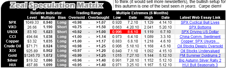
Zeal Speculation Matrix All the Matrix is, for the most part, is an ongoing study of where certain key prices happen to be relative to their trailing 200-day moving averages. This includes looking at current Relativity levels and comparing them to their latest relative trading range as well as extremes they've achieved in the past six months. By watching such indicators we can detect extremes early which leads to all kinds of excellent opportunities to trade. A sample Matrix is pasted below and then specific parts of it are expanded upon in some detail. You can click on this Matrix to see it back in its original context in Zeal Intelligence if you wish.
We usually track about 10 trading indicators at a time in the Matrix, and almost all of them are pure Relativity-based trading indicators. Another ten columns of information follow each trading indicator, which are explained in depth below. As for the indicators themselves, the small r before them denotes that they are Relativity-based. For example, rGold is Relative Gold, or the gold price divided by its own 200dma. rOil is Relative Oil and rSilver is Relative Silver. In this sample above, the last indicator does not have an r in front of it so it is the only non-Relativity-based trading indicator here. Sometimes we highlight non-Relativity indicators too.
Changing the Matrix You will notice above that some cells are shaded red. We shade cells red to highlight changes since the last Matrix was published. So in Zeal Intelligence, a red highlight means that the value of a cell has changed since the previous Zeal Intelligence of one month earlier. In Zeal Speculator a red highlight means a value has changed since the last ZS, whether it was a week earlier or even more recent. We use these red highlights so you can quickly and easily spot changes in the Matrix and decide if they are relevant to you individually. If you are trading a sector with a change, it pays to carefully consider any new extremes.
The usual columns that are highlighted red for changes are the four extreme columns. These are explained in more depth below, but they basically highlight the most extreme Relativity levels seen in a particular indicator over the last six months. A new relative extreme often signals an in-progress topping or bottoming and hence a potentially excellent opportunity to trade.
There are only two cases when we change the Matrix but don't highlight the changes in red. The first involves the first couple columns which are the current underlying price and current Relativity readings of the r-version of that price. Since these two columns change every time the Matrix is updated, they are never highlighted in red. In addition, in the four extreme columns, rolling changes that update past data aren't highlighted. These extremes only go back six months. So say in month seven an old extreme drops beyond that range and a new extreme must be chosen. The new extreme could be four months back, or three, or anywhere. In this case, in just rolling off an old extreme, the change is not highlighted since it is not a fresh new extreme relevant to traders today.
Current Price and Current Level These columns are the current price and current r-level for each sector tracked. In the example above, the current gold closing price on the final day of the trading month before ZI was published the next morning was $570.70. In relative terms this meant gold was trading at 1.236x of its own 200dma. Similarly, the XOI oil-stock index actually closed at 1143.10 which meant it was trading at 1.191x of its own 200dma. These r-levels show where each indicator currently is today. For Zeal Speculator, if a particular day's ZS is published after the market close then its Matrix is updated with closing data from that day.
Current Bias The bias column is one of the most important columns in the Matrix. It shows how we view each particular sector that we are tracking. In the sample above, the new rGold extremes changed our gold bias from Long (bullish) to neutral. Since this was a change from the previous month's ZI, it was highlighted in red to make it stand out. The most crucial thing to understand about bias is it is based on all the information we are aware of at Zeal, not just the indicator state. So rarely even if a particular indicator's position within its range calls for one type of bias, we may have another if we feel other information overrides this indicator. This is uncommon since these indicators are good, but please realize that situations can exist where our bias conflicts with the r-indicator.
Our three types of bias are long, short, and neutral. Long is the most important bias since it applies to investors and speculators alike. When we have a long bias, it means we believe that a price is at or rebounding off of a major interim low. As such, it is a good time for both investors and speculators to add positions on the long side, betting the price will rise. We maintain this long bias until an upleg (or bear-market rally in a bear) starts looking mature and trades into the part of its relative range that demands a neutral or short bias. The best time to add new positions is right after a bias changes to long, usually near a major interim bottom.
Our neutral bias is where we stand when an upleg in a particular bull starts to look mature and overextended. In the example above, the HUI gold-stock index traded up to 1.524x its 200dma which was very high relative to its history at that time. As such we went neutral on it. Neutral means we wouldn't want to add new gold-stock positions at that time since the probability of a correction is high. But despite this we didn't sell our existing gold-stock positions outright either. Instead we held them and just tightened their trailing stop losses up to a smaller percentage to preserve more of our profits if a correction really did materialize. Since bulls tend to surprise to the upside, it makes more sense to be neutral near perceived tops just in case an upleg runs higher than expected.
Our final bias is short. This means we are temporarily bearish on a particular sector, we expect prices in it to fall lower over the coming months. Short is far more relevant to a speculator than an investor, since the former can buy puts on a likely-to-fall sector or short it outright. All an investor can do if a pullback is imminent in his sector is steel himself for the expected price weakness so he isn't traumatized by it emotionally and flustered into selling at the wrong time (usually the bottom). Short biases are most likely to be seen in secular bears, since it is in these bears that prices tend to surprise to the downside so it is advantageous to be short.
Finally, in the sample above we are tracking r-values for a couple implied volatility indexes, the VIX and VXN. They themselves are used as indicators for the US stock markets. So our short bias on these indicators is not for shorting these indicators specifically, but for shorting the underlying stock markets that they track. Unlike our other relative indicators that apply directly to their underlying price, the volatility indexes are a special situation. Our bias doesn't apply to them directly, but to the stock markets that they represent. Hence our bias here in this unique case is a pass-through bias. But this is the only place where our bias is indirect rather than direct.
General Range Long to Short Relativity trading indicators tend to form nice horizontal ranges in orderly trending markets. The lower end of this horizontal range is the region where probabilities are highest that the next major move will be higher, hence it is the long zone. The upper end of this horizontal range is the region where the odds are the greatest that the next major move will be lower, so it is the short zone. Interestingly this applies equally in both bull and bear markets. In both cases the lower part of the relative range is where prices trade before they move higher and the upper part is where they trade before they move lower.
In bull markets prices are advancing, moving up so their 200-day moving average has to gradually follow higher, so the lower part of the relative range is usually around 1.00x, or right at a price's 200dma. Meanwhile in bear markets prices are falling on balance, or moving down so their 200dma has to gradually follow lower. As such, in bear markets the 1.00x level at a price's 200dma is usually at the top of its relative trading range. This particular attribute of relative trading ranges is what enables low levels to be long levels and high levels short levels in bull and bear alike. The only difference is whether the range is mostly above or below the 200dma.
How do we define these relative trading ranges? Through a lot of charting. For each of the relative trading indicators included in the Matrix, we have a long-term chart updated twice a week that shows the underlying price as well as the indicator charted over time. You can see these charts for yourself on our Zeal Speculation Matrix Charts page. (logon and password are located on Page 8 of the current issue of ZI) After a price has been in a secular trend for a while, it tends to have enough relative turning points to define a horizontal trading range. It is these horizontal-range levels that are listed in these columns each time the Matrix is published.
Now setting these horizontal range levels, even with a chart, is more of an art than a science. While a relative indicator spends most of its life in the range, its extremes to the upside or downside can sometimes stray well outside of our defined range. In addition, we have to try and set our range levels so we have early warning of a high-potential interim turning point. For example, if an r-indicator once went to 1.20x but usually tops near 1.15x, we would probably set 1.15x or a little lower as the upper band of our range. This would lessen our chance of missing the next extreme. While somewhat subjective, we don't change relative range bands very often and we are continuing to try and fine tune our methodology for defining these ranges. Despite this, they are very useful constructs.
Most of the time it is when an r-indicator trades above the top or below the bottom of its relative range that a change in our bias is triggered. So by watching a particular sector's r-indicator each month relative to its range you can have early warning of when it is threatening to go high enough or low enough to break out of its range and force us to consider a bias change. Watching the progress of these r-indicators within their ranges over time also provides an excellent proxy for sentiment within the sector as a whole. And since it is sentiment that drives short-term prices, this is extremely valuable knowledge for investors and speculators to have.
And of course during those rare times when we change an r-indicator's range, we will highlight the change in red to make it readily apparent. Ranges are typically only changed after a major new upleg or major new correction hits new extremes well outside of our existing relative range that necessitate expanding it for a closer match to the actual data. In addition, relative ranges can be shrunk down as well if new uplegs or new corrections are tending to get smaller on balance and are no longer touching our chosen bands with some regularity after major moves. Thankfully these events don't happen often so the r-ranges are generally pretty static.
Latest Interim Extremes The four latest-interim-extremes columns highlight the highest and lowest r-values achieved by a particular indicator in the last six calendar months. By comparing the current r-level with the extremes of the last six months you can see whether a particular price happens to be relatively high or relatively low compared to its recent precedent. Fresh new highs and lows are highlighted in red to make them more obvious. These new interim extremes are especially important to watch when the r-value is nearing one of the boundaries of its current trading range. This can help anticipate a possible imminent major interim reversal.
As discussed above, the only time we don't highlight a change in an extreme column in red is when it is just a rollover to a newer month's low in order to keep these extremes in the last six months. For example, if this month is January and a new extreme is achieved, we will highlight it in red. But if a new extreme hasn't been achieved for seven months so it rolls off our six-month window, then we will replace it with the most extreme value from the latest six months which will be a little less extreme than the one that just rolled off. For these rollover changes just to keep the data current to six months or newer, changes are not highlighted in red.
Latest Research Essay The final column in this table has hyperlinks to the latest research essays that describe a particular indicator in action. They can include recent charts of the indicator, discussions on its behavior, or changes in its relative range. By clicking on and reading one of these essays you can find the latest we have published on a particular indicator. If you are a hardcopy subscriber and have no hyperlinks to click on in your hardcopy version, all you have to do is type the title into Google and you will find our essay right away. Or you can click on our essays page here and then search for the title on that page alone. Either way will get you there. |
|||||||
|
|
|
|
|
|
|
|
|
|
|
|
|
|
|
|||