![]()
US Equities: A Strategic Perspective
Adam Hamilton July 13, 2001 3867 Words
Throughout the long and bloody military history of humanity, the value of information and intelligence has proved to be absolutely priceless for winning any military engagement or campaign. Information and intelligence allows generals to precisely plan and tailor their offensive thrusts or defensive stands to counter whatever specific threats they may be facing. There are innumerable examples in the history of warfare of underdogs winning decisive military engagements simply because they had access to better information and intelligence than their foes.
In Tom Clancy’s incredible book “The Bear and the Dragon”, he provides a magnificent modern example of the power of information in the endeavor of war. In his excellent book, a vast invading force faces an overwhelmed and relatively under-equipped tattered defensive array. The outnumbered defensive forces, however, are able to deploy new technology to have a virtually real-time strategic view of the battlefield. This critical marginal flow of information provides the defenses with such a huge advantage that they utterly destroy the massive and far superior invading force.
The vast power of information on the battlefield was also proven beyond any doubts in the Gulf War against Saddam Hussein’s Iraqi forces that invaded and razed Kuwait. Although US armor on the ground faced seemingly endless waves of the best Russian tanks available at the time, US armored cavalry command was able to rout the elite Iraqi forces with scarcely any allied casualties partially because of an enormous advantage in information.
Every tank platoon knew exactly where it was relative to the earth and other hostile and friendly forces thanks to the modern technological wonder of the US Department of Defense’s Global Positioning System satellite constellation. The generals commanding the US and allied forces could quickly and easily direct US armored columns to the precise spot of the endless and formless desert wastelands to ambush and annihilate Iraqi armor. Information, when used wisely in modern warfare, can prove far more important than raw firepower.
In the broadest sense, valuable information for battle can be broken down into two types, strategic and tactical information. Strategic information is broad, overview, “God’s eye” type of data. It is the big picture of the entire theater of operations. Tactical information is much more focused and narrow and provides far more battlefield detail but on a much more limited area.
As an example of this critical difference, imagine a tank platoon commander’s four tanks approaching a hill, sending a scout up the hill, peeking over, and spotting four enemy tanks. What should he do? The fact that the scout sees four enemy tanks is tactical information. Tactical information is very necessary and can be highly valuable, but only when colored with the true macro perspective provided by relevant strategic information.
For instance, if those four enemy tanks over the hill are all the enemy armor in the area, it may be a good opportunity for a little skirmish to take out some of the opposition. The tank commander may choose to load up his platoon with high-explosive anti-tank or sabot rounds, pop over the hill, and send some bad guys to meet their Creator.
If, however, those four enemy tanks are lead elements of an entire advancing enemy armored division, it is most likely time to get the heck out of dodge fast. It would be the height of lunacy for the tank commander’s four tanks to attempt a firefight with dozens or hundreds of enemy tanks. The strategic perspective on the tactical battlefield situation makes all the difference in the world on the appropriate course of action to undertake.
The big strategic perspective, the “God’s eye” view of the battlefield, puts tactical information into proper perspective. Without a valid strategic perspective, battles and wars are lost as mistakes are made when tactical data is acted upon alone.
Another interesting attribute of strategic and tactical information is that it only flows one way. Our tank commander behind the hill cannot alone extrapolate the data provided by his scout to provide a strategic picture, even if he is the best tank commander in world history and has infinite computing power. Being on the ground at the battlefield in a tactical situation, there is no way to gain the strategic picture unless someone outside his range of perception provides it to him via radio or data link. The tank commander doesn’t have any idea what he is missing because he has no concept of the big picture.
On the contrary, a general back in headquarters with a strategic view of the battlefield can see everything at once. He may not be able to discern details to the degree of our tank commander behind the hill, but he can certainly glean the big picture. With that broad perspective, he can always zoom in and drill down and easily flesh out the tactical picture for any small area of a strategic perspective. Since the general has the big picture, he knows where he needs to look to find more relevant tactical information if necessary.
Information can flow naturally from a strategic to a tactical view, but not from a tactical to a strategic view. If one is mired in the tactics, they have no concept of the strategic big picture and cannot discern it without outside information. On the other hand, if one has access to the strategic big picture, they can easily find out where to look to obtain more tactical details if necessary.
A strategic perspective is priceless.
Information and intelligence on the US equity markets can also be broken down into strategic and tactical perspectives.
In our strange new era of endless information flows, real-time quotations and trading, bubblevision, and the pervasive ultra-short-term quarter-to-quarter focus, the investment world seems hopelessly mired in a tactical environment and buffeted by effectively infinite information flows. Down in the pits watching the current market action on a minute-by-minute basis, it can be almost impossible for investors to discern the big picture. The trees of the financial forest are in sharp detail, but few have a concept of what the strategic forest looks like.
An investor who lacks a strategic perspective on the markets places his or her capital in no less danger than a tank platoon commander who has spotted the enemy but does not know if it is some lone armor platoon or the lead element of a huge enemy division. Strategic perspective is incredibly valuable and can make the difference between glowing success and crushing failure in the unforgiving and potentially lethal modern investment arena.
As the bulls and bears alike these days are all standing around scratching their heads in confusion over market behavior and wondering what is careening down the pike next, it feels like there is an amazing amount of uncertainty surrounding the equity markets. Virtually everyone seems to be married to a very-short term tactical perspective, lost in the forest but not caring because they are too busy intensely studying the individual trees.
In this essay we will zoom way back out in an attempt to gain a valuable strategic perspective on the current state of the US equity markets.
For a military commander a strategic perspective usually entails understanding troop movements and unit positions over a much broader geographic area. For an investor, the strategic perspective is defined not by distance, but by the fourth dimension of time. Rather than looking at the markets in terms of a few months or a year, as is common practice these days in all the mainstream financial media, we decided to take a decade-long strategic perspective in this essay.
We constructed graphs of the NASDAQ, Dow Jones Industrial Average, and S&P 500 indices with daily closing data beginning on the first trading day of 1990. This longer view of the markets helps a great deal in gaining priceless strategic perspective on the current levels of the major US equity indices. The last datapoint in all the graphs is Wednesday July 11, so the spectacular Microsoft/Motorola blue skies mega rally of July 12 is not shown. With a longview type strategic perspective, a couple additional up days or down days are immaterial in the overall scope of things and ultimately not important.
As a further tool to hone strategic perspective on the US equity markets, we plotted a 7.5% compounded return in each graph beginning with the first data point in 1990. This red line in all the following graphs defines where each equity index would be today if it conformed to the average annual 7.5% compounded return beginning in 1990.
Throughout all US equity market history, common stocks have averaged a return of roughly 7.5% per annum. This corresponds with the incredibly important historical average equity P/E ratio of 13.5 that we have discussed ad infinitum in previous essays. A P/E ratio of 13.5 implies a return of roughly 7.5% over the long haul. (1 divided by 13.5 is approximately 7.5%) Sometimes equity markets return more than 7.5%, sometimes less, but over a strategic timescale they always regress back to their long-term average rates of return after boom periods of extraordinary returns or bust periods of dismal returns. Mean regression is well documented in market history and leads to one of the lowest risk and most successful methodologies available to play the markets.
We begin with a strategic perspective on the notorious NASDAQ bubble, which even the endless line-up of Wall Street shills paraded on bubblevision now admit was a classical speculative mania.
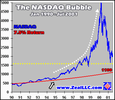
Viewed from a long strategic perspective, it is hard to believe that anyone truly thought the NASDAQ mania of late 1999 and early 2000 was a sustainable event. Yet, as we all know, virtually everyone was sucked into the mania and the vast majority of investors have lost colossal amounts of capital as it began to burst.
The dotted white arrow outlines the parabolic arc the NASDAQ bravely launched on in the mid and late 1990s. Parabolic growth curves like this almost always end in sharp tops and terminal-velocity fast declines, whether in the financial markets or natural world. If biologists were studying a population of animals whose numbers rocketed up like this, the biologists would immediately know the equilibrium is out of balance in the ecosystem and a population collapse is imminent because a parabolic exponential increase is inherently unsustainable.
As we mentioned above, the red line shows what the NASDAQ would have done if it had followed the normal expected 7.5% compounded equity growth curve. At this moment in time, it would have led to a NASDAQ composite index valued at only 1100, not the lofty levels we saw in the bubble. It is VERY intriguing to note that the NASDAQ jumped the tracks and headed on its rocket ride to the moon around late 1994-early 1995 as marked by the white arrow.
As we have also discussed in past essays, the late 1994-early 1995 timeframe marks the advent of all kinds of strange financial discontinuities. Around that time, the US Federal Reserve started to aggressively ramp up its rate of fiat currency debasement, firing up the printing presses and ballooning US money supplies at dizzying rates far above economic growth. Also, Fed Chairman Alan Greenspan and New York Fed President William McDonough made a stealthy end-run around the United States Congress and decided to unilaterally take seats on the secretive Bank for International Settlements in Switzerland around this time, contrary to original American intentions regarding the BIS. This anomalous period in the mid-1990s also marked the beginning point of strange and illogical trading patterns in the global gold market. The Gold Anti-Trust Action Committee (www.gata.org) has done extensive research on the nefarious fun and games in the gold market hatching around the same odd time when the NASDAQ jumped its rails and roared through the stratosphere.
It is always interesting and highly educational to observe the interrelationships and causal chains among various seemingly unconnected on the surface market events. Make a big mental note of this strange late 1994-early 1995 timeframe, as you will see it again in our Dow Jones Industrial Average and S&P 500 graphs below.
The yellow dotted line above marks the early April lows in the NASDAQ, when virtually every professional and amateur market prognosticator in the known universe emphatically declared a bottom was laid in. We have always thought that notion is pretty fanciful, however, as in all historic bubbles we have studied the ultimate bottom is far, far below fair value, not way, way above it. If this NASDAQ bubble burst ends at a stellar valuation after only wiping out a few years of bubble gains, it will be the first time that has ever happened in history and will challenge the very fundamental laws of finance.
Armed with a longview strategic perspective on the NASDAQ, it is incredibly audacious to make the case that we are at the very verge of an exciting new bull market. In light of market history and past experience, there is a very large probability that the next large down-leg is rapidly approaching. The ultimate bottom will likely be at levels one-half the valuation of the red normal return line, around 500, and not twice the normal return levels.
As a second witness to what the perma-bulls consider a heretical idea, that bubbles have consequences, the NASDAQ 100 had a market capitalization weighted average P/E ratio of an astonishing 74.3 at the end of June. If you are a realist, fair value is around 13.5, and if you are a raging optimist you could possibly make the case of a normal NASDAQ 100 valuation around 20.0. Either way, the NASDAQ darling big-caps remain grossly overvalued for the earnings and cashflows they are able to spin off. Yet Wall Street continues to herd naive investors into these traps like sheep to the slaughter. Fair value for the NASDAQ is deep down in the three-digit abyss nowhere near current lofty index valuations hovering around NASDAQ 2000.
Before we move on to the DJIA and S&P 500, we want to briefly zoom in on the NASDAQ since January 2000.
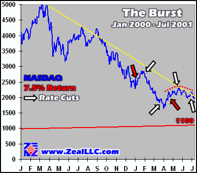
This is one ugly chart, no doubt about it. It is incredible to witness this broad index comprised of many thousands of stocks swan dive off this steep of cliff in so short of time.
The six arrows mark the individual interest rate cuts that defined the single most-aggressive six-month period of Federal Reserve easing in its entire dismal 88-year history. The red arrows mark the two hurried and frantic inter-meeting emergency rate cuts, both of which were so incredible that we hammered out individual essays on each one at the time they were launched at the struggling markets. Truly extraordinary times in which we live and trade!
It is very ominous that the NASDAQ and other US equity markets continue to fall even with the Fed doing its darnedest to inject vast amounts of liquidity into the stressed system. We vividly remember all the euphoric bullish joy in early January when bubblevision and the pundits assured the frightened American investor that stock markets ALWAYS rally on interest rates cuts. Really? Sure doesn’t look like that is the case this time, eh.
The dotted yellow line marks the top trendline defined by the NASDAQ super-top in March 2000 and the initial big bounce following the NASDAQ crash. Interestingly, this trendline has only been briefly broken twice, once following the initial bounce and once in recent weeks. While the perma-bulls staunchly believe we are going to chainsaw through this resistance line and launch a roaring new rally into year end, we don’t believe the popular hype for a second. Never in history has a bubble recovered and been re-inflated before the bust has fully run its course and unwound almost all of the speculative excesses of the preceding bubble. If fundamentals, history, and cashflows still mean anything, and we are sure they do, then the next big move out of this frustrating NASDAQ trading range will be down, not up.
Finally, the dotted red curved resistance line on the right notes the incredibly difficult time the NASDAQ rallies have had since April. Even with Greenspan’s three latest fervent rate cut ritual sacrifices to the false gods of the New Era, all the rallies have been small and have been quickly smashed before they can grow legs and run higher to 2500. It is also an ominous portent that the red resistance line has curled over and looks like an inverted bowl. Every successive NASDAQ rally is shattered after it only marches north a few percent, even with the accommodative Fed, trillions of dollars of money market “cash” sloshing around seeking an equity home, and incredibly bullish sentiment. The whole formation looks very toppy and we believe the NASDAQ remains incredibly risky with the vast weight of probability suggesting the next big move is down again.
When divorced from the short-term tactical mire and viewed from a strategic perspective, the current muddled tactical situation of the NASDAQ is greatly clarified and danger signals abound. Caveat Emptor.
Moving on to a strategic perspective on the Dow Jones Industrial Average, we see many similarities with the bubblicious NASDAQ.
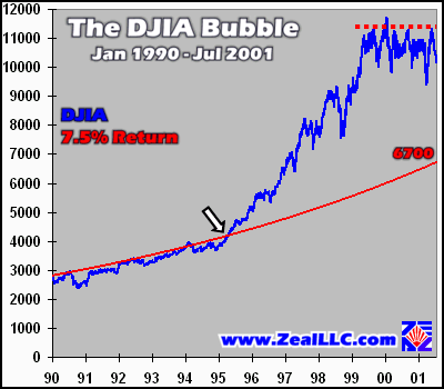
Note the exact same type of disconnect with the 7.5% average return line around late 1994-early 1995 as we observed above in the NASDAQ bubble, marked here with the white arrow. Also we can see a dashed red heavy defensive resistance line around 11,500 on the upper right corner of the graph.
Although there are not yet a lot of folks around who think of the Dow as a bubble, it sure looks like one with the benefit of a broader strategic perspective. Since the Fed began its fiery injections of money into the capital engines of the US equity markets, the DJIA has traded far above where it would be expected to trade in a period of normal returns. Interestingly, fundamental valuations provide important confirmation that the DJIA is trading at bubble-type levels nowhere near normal based on the underlying cashflows and earnings its 30 blue-chip companies are able to spin off. As of the end of June, the DJIA had a market capitalization weighted average P/E ratio of 27.5, over twice the normal historical valuation levels.
With plummeting profits and the economy shaky and likely already recessionary, the meager earnings now precariously supporting the Dow are likely to plunge even further in the second half of 2001 pushing its P/E to even more breathtaking extremes. We expect to see the Dow Jones Industrial Average ultimately swoon to levels well below the red 7.5% return trend line above. In historical episodes when the Dow approached this degree of overvaluation it soon collapsed and valuations were ground down to around one half of normal or a 7.0 P/E before a significant uptrend began again.
Like the NASDAQ, the DJIA looks incredibly toppy, it has a very weak fundamental foundation, and the global business environment is turning more ugly by the day. The highest probability for the next major Dow move is a significant down-leg, just like the imploding NASDAQ.
Finally, no strategic reconnaissance of the US equity markets would be complete without a peek at the venerable Standard & Poor’s 500, the 500 best and biggest companies in the United States of America.
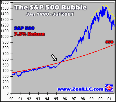
Is this chart pattern looking familiar by now? All the broad US equity markets followed normal growth patterns until late 1994-early 1995 and then mysteriously took off like intercontinental ballistic missiles in their ascent leg. It continues to intrigue us greatly that at about the same time the Clinton Administration’s policy of aggressive market intervention under Robert Rubin commenced (he was sworn in as Secretary of the Treasury on January 10, 1995), the US financial markets all roared towards the ethereal heavens in unison. Returns and valuations were driven to lofty levels far beyond sanity in all US equity markets as the deluge of newly minted fiat capital competed for destinations.
The fundamentals for the S&P 500 are also dismal, as it had a market capitalization weighted average P/E ratio of 37.5 in late June, far overvalued by all historical norms.
This week we had to chuckle at Queen Bull “Gabby” Abby Joseph Cohen’s reiterated end of year target on the S&P 500 of 1550. Holy cow! Hath she not a calculator? With the S&P 500 trading around 1200 today, we would need to see this huge broad index roar up by 29% in six short months to meet her target. Annualized, Ms. Cohen is boldly predicting a 58% rate of return from now to the end of the year in the S&P 500. Talk about irrational exuberance!
Ubiquitous bullish propaganda aside, the case can be made that the S&P 500 has now already embarked upon a bear market down-leg. Notice the dome-shaped yellow dotted line marking its super top in 2000. Many mainstream market analysts claim the S&P 500’s poor performance is explained entirely by the tech stocks in the index, but we have our doubts. With an ever-increasing phalanx of layoffs, earnings warnings, and horrible performance in corporate America, it would not be at all surprising if a bear market is already stealthily underway in the S&P 500. We will all have to patiently wait six months or so to have enough datapoints to know for sure, but odds are the S&P 500 has initiated its mean regression to painfully migrate to more normal valuation levels.
Just as a strategic battlefield perspective can prove decisive for a military commander, it can also be worth its weight in gold for investors and traders in the turbulent financial markets. While watching the financial media, reading the papers, and surfing the Net, it rapidly becomes apparent that the overwhelming popular focus on the US equity markets is highly tactical in nature. Only by soaring above the crowd and taking into account history, valuations, and long-term perspectives can savvy contrarians gain an enormous advantage over their peers by seeking out and obtaining the priceless strategic worldview of the US equity markets.
Like computer operators touching the glass of their CRT monitors with their noses and only seeing a confusing mosaic of big colored pixels in exquisite detail, market participants who are caught up in the short-term Wall Street hype are missing the big strategic picture. Only by pulling far back away from the screen do the individual datapoints, the pixels, form into a coherent, understandable whole. Instead of focusing exclusively on day-to-day gains and losses and trading minutiae, the prudent investor continually searches for the longview, that crucial strategic perspective that enables true market discernment.
As we strive to transcend the market battlefield today and soar to the heavens for the God’s eye view of the action, the strategic big picture continues to look disturbing. Something strange and anomalous occurred in the second half of the 1990s in all the major US equity indices. The returns we all witnessed, the lofty valuations, and the disconnect with underlying cashflow reality are not healthy and normal. The strategic picture continues to point to markets poised for a huge fall or a long, grinding bear market, not a miraculous new phoenix rally arising from the ashes.
Adam Hamilton, CPA July 13, 2001 Subscribe at www.zealllc.com/subscribe.htm
![]()