|
|
|||||||
|
|
|
|
|
|
|
|
|
|
|
|
|
|
|
|
|
|
|
Deflating the Dow Adam Hamilton March 23, 2001 3598 Words
One of the most common bullish mantras on Wall Street these days is “inflation is dead”. By spouting this fantastic assertion, the parade of experts pontificating on bubblevision and the financial press zealously attempt to persuade the average mutual fund investor that all is well for the long term investor. If inflation is dead, the Federal Reserve will be much more likely to lower interest rates, which is generally positive for the stock market. If inflation is dead, there is less reason to consider traditional hard asset inflation havens such as long besieged gold. If inflation is really dead, the relative attractiveness of US equities to other investments increases dramatically. Much rides on the perma-bulls’ carefully articulated premise that inflation is a relic to be forgotten that can pose no threat to our modern economy.
Inflation, unfortunately, is hardly even understood today. If you look in a dictionary or economics textbook, you will find that inflation is a rise in general price levels CAUSED by an increase in the money supply. If relatively more money chases relatively fewer goods, prices rise. The money supply in the United States, of course, has been growing like a noxious weed on Miracle-Gro, so we believe it is inevitable that this new money will eventually pour over into goods and services, causing rampant price inflation in the US economy. We wrote an essay about the rocketing money supply about six weeks ago, called “Exploding Inflation”.
In that earlier essay we used a variety of examples to explain inflation. Since then, an actual episode of inflation has come to my attention that was strangely fascinating. It was a perfect example of immutable laws of economics working in a closed virtual world in cyberspace.
I was talking with a young friend recently, and he was telling me about a popular online computer game called “Diablo”. Apparently, in this game, people from all over the world play at the same time via the Internet. The goal is to create a character in the game and go out and slay monsters and hellspawn. My young friend said the game is very popular amongst his peers right now because it is so fun. When players kill diabolical fiends, the power of their characters increases and the monsters drop items that can make the player’s character even more deadly. The game is addictive as everyone competes to have the most powerful character and the best items.
This discussion would not have stuck in my mind to this point, but then my young friend told me something which piqued my interest. He claimed that a whole economy had sprung up around trading items in Diablo. Players can meet in cyberspace and trade an item they have to someone else for an item they want. I was skeptical about a virtual economy, and encouraged him to explain. What he told me was fascinating and a textbook case of inflation.
When Diablo was first released last summer, one of the most sought after items was a ring that online characters could wear, called the “Stone of Jordan”. These rings were very hard to find. They were scarce, highly sought after, and the aggregate supply grew relatively slowly. In short, they were almost like gold in the real world and they became the de facto currency for players in the game wishing to trade items to other characters.
In the early months of the game’s release, my friend told me that one or two of these rings, which are all identical and fungible, would buy some of the most powerful weapons in the game. So, if a player was fortunate enough to find a rare Stone of Jordan, he or she could trade it for a very deadly sword for his or her character, for instance. The rings became the trading currency, the “coin”, of the virtual realm.
Last month, when my friend and I had this conversation, he told me that now the rings have proliferated and become much more common. As hundreds of thousands of people from around the world played the game over the Internet, more and more rings were found and the aggregate supply of Stones of Jordan, the de facto Diablo currency, increased dramatically. Now, instead of one or two rings buying an elite weapon, it takes between forty and eighty of the same rings! Because the aggregate supply of rings increased in the game so dramatically, the relative value of each ring decreased enormously. Last summer, one or two rings was a great amount of virtual wealth. Now, forty to eighty are needed!
As an admittedly bizarre sidenote, my friend said that these virtual rings were selling for $50.00 REAL US dollars each on E-Bay last August, but now are running about US$1.50 each on E-Bay today.
All of this “inflation” in this virtual world in cyberspace simply occurred because the supply of “money”, these rings, increased in the aggregate at a rate faster than the supply of good items to “buy”, or trade, grew. As players found and traded for more rings, each ring became worth less and less in their eyes and they needed more rings to consecrate a trade.
The anecdote my young friend shared with me was particularly fascinating because it was a microcosm of the real world! Hundreds of thousands of independent players, most of whom never know each other personally in either cyberspace or the real world… A fungible commodity accepted by all as “money”… The supply of “money” increases rapidly in the aggregate… The perceptions of the value of the “money” in the virtual world dropped dramatically… And the virtual currency of Diablo, the Stone of Jordan, was vastly inflated and now each ring is nearing worthlessness, according to my friend.
As in this virtual online game played around the world, the exact same phenomenon will happen (and HAS happened for decades) in the United States as the Federal Reserve continues to relentlessly increase the currency supply.
When the perma-bulls on parade march on bubblevision, they continue to sucker in the small investor through assertions that over time, stocks have excellent returns that exceed inflation, and that a “long-term” investor will always come out ahead. Naturally, we think this assertion is wishful thinking at best and maliciously deceptive at worst, so we decided to look at historical Dow Jones Industrial Average returns in light of inflation. In this essay we compare the nominal DJIA return with which we are all familiar to various real DJIA returns. To account for inflation, we deflate the DJIA of the last four decades by the CPI, the M1 money supply growth, and the M3 money supply growth.
Before we begin, it is important to understand the difference between “nominal” and “real” numbers. Nominal numbers are the everyday prices or index levels we commonly follow. The DJIA index number we see everyday is nominal, reported rates of return are nominal, nominal numbers are basically just a dollar taken at face value. With ordinary nominal numbers, no adjustments are made to account for the ever-shifting purchasing power of a dollar.
Real numbers, in contrast, attempt to quantify the loss in the dollar’s purchasing power. If you received a dollar one year ago, and you stuffed it in your mattress, the dollar will be able to buy less of a good or service today than it could have one year ago. On every dollar we own, the purchasing power is relentlessly reduced because the dollar supply increases every year. Inflation. A real number is a nominal number that is adjusted, attempting to account for inflation. Real numbers are very important because they help expose the ravages of inflation, which usually fly below our mental radars, to our conscious minds.
In 1975, a loaf of bread cost a quarter. Today it might cost two dollars. The same item, a single loaf of bread, had a nominal price of $0.25 in the mid-1970s and a nominal price of $2.00 today. Because of inflation in the US money supply, it now takes more dollars to buy a single loaf of bread, just as it now takes many more “Stones of Jordan” to buy items in the online Diablo game than last summer. In real terms, the dollar has plummeted in value because a loaf of bread today is not fundamentally different than 25 years ago, yet it costs many more dollars.
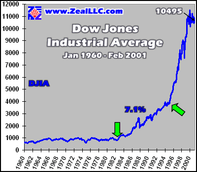
Before we convert the nominal Dow Jones Industrial Average into various “real” DJIAs, it is useful to look at the nominal index since 1960. All data is this essay is monthly, and all returns were originally compounded monthly and then converted into compound annual growth rates. The data in all these graphs only runs to February 2001, so it missed the recent sharp break in the DJIA witnessed in March (we recently wrote an essay anticipating a long, ugly Dow fall called “The Dow Doldrums”, for anyone interested)…
Since January 1960, the DJIA has witnessed a nominal compound annual rate of return of 7.1%, which is respectable and in line with the 13.5x historical average equity price earnings ratio, which implies a 7.4% return on capital. (1 / 13.5x P/E = 7.4%) As is quite evident above, most of this return did not accrue until the last 18 years. The first green arrow, which are used throughout this essay to mark “inflection points”, where the slope of a graphed line changes decisively, notes the low in 1982 that signaled the beginning of the greatest bull market in US history. Until this bull began, the DJIA spent 22 years rolling listlessly in a sub-1000 range. It is hard not to feel sorry for “long-term” equity investors who bought in 1960 and intended to cash out and retire in the early 1980s!
Without the benefit of a long-term graph, the DJIA levels around 10000 we have witnessed in recent years seem “normal”. With a four decade perspective, however, the pattern on the DJIA looks ominous. The four decade DJIA is a textbook example of a parabolic or exponential growth curve. In nature this chart pattern is ALWAYS unsustainable. For instance, if a population of animals grows at this kind of rate, eventually they will run out of food and resources and the population will be decimated through famine, infighting, or plague. In the financial markets, these types of patterns are also ALWAYS unsustainable.
In short, the DJIA is a BUBBLE! Compare the DJIA since 1995 with a NASDAQ chart from autumn 1999 to March 2000, and the patterns are virtually identical. The only difference is the DJIA bubble grew more slowly than the NASDAQ bubble that we all witnessed explode gloriously last year. The second green arrow marks the point where the DJIA entered its final terminal blow-off phase, initiating a near vertical rise in 1995.
It is critical to remember these important points about the nominal Dow since 1960… First, virtually ALL of the gains of the DJIA over four decades happened in the last fifteen years. Second, an exponential growth curve leading to a parabolic blow-off is ALWAYS unsustainable in financial markets. The Dow will NOT be the first exception to six thousand years of economic history!
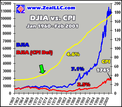
With this background, it is time to launch into an investigation of REAL DJIA returns in the last four decades. We begin by deflating the DJIA with the growth in the Consumer Price Index, the most widely accepted indicator of consumer inflation. In the past we have written about the statistical wizardry that the Bureau of Labor Statistics uses to water down the CPI (see our “Lies, Damn Lies, and CPI” essay), and we still believe it is a suspect measure of consumer inflation, ESPECIALLY during the Clinton era where timeless personal attributes like honor, honesty, and integrity were forgotten in the most scandal ridden US Administration in the history of our great nation. Nevertheless, even with the readily apparent Clinton BLS manipulation aside, the CPI is still the most widely followed measure of inflation in the US today.
In the graph below, the nominal DJIA is shown in blue, and the REAL DJIA, deflated by the CPI (adjusted for the loss of purchasing power as measured by the CPI), is shown in red. Both nominal and real DJIA are slaved to the left axis. The yellow line shows the CPI, which is tied to the right axis. Beside each line, there is an appropriately colored number that represents the compound annual growth rate of each data series…
When the DJIA is deflated by the CPI, the real return of the index averaged only 2.5% compounded annually in four decades! The CPI deflated DJIA closed at 1745 at the end of February 2001. Even though these numbers were computed with monthly data and compounded monthly since 1960, they can also be derived through simple math. With the nominal DJIA scoring a 7.1% return, and inflation measuring 4.6%, the real rate of return on the DJIA over this time period is 7.1% less 4.6%, or 2.5%. NOT very impressive!
Holding the DJIA since 1960, an investor would have reaped an average real return of only 2.5%. At a 2.5% annually compounded return per year, it takes about 29 years to double one’s money. Let this sink in a second, as it is important.
Wall Street propaganda aside, even including the parabolic Dow bubble blow-off stage of the last decade, an investor would see their capital double, in absolute purchasing power terms, only once every 29 years! This helps underscore the devastating nature of fiat currency inflation and how hard it is to escape the “hidden tax” imposed by irresponsible fiat currency growth. Inflation is absolutely lethal to capital, and as the yellow line on the graph above indicates, consumer prices have grown remarkably rapidly and consistently for almost three decades.
In August 1971, President Richard Nixon defaulted on the US obligation to pay gold on demand to foreign holders of the US dollar. Through brazen socialist theft, President Franklin Roosevelt had denied American citizens the right to redeem dollars for gold in the early 1930s, but the dollar was still on a “gold standard” internationally for four more decades. Unfortunately, after the United States decided to renege on its promises to pay foreign dollar holders gold on demand in 1971, the US Federal Reserve lost all incentives to restrain money supply growth to a reasonable rate. The US dollar, once the mightiest currency in the world, became 100% fiat, mere paper backed by promises to pay. Since that day in August 1971, which will live in infamy, the CPI has accelerated ever upward quantifying the increased flood of essentially worthless fiat dollars the US Federal Reserve dumps into our economy each year. It is truly sad to see the once mighty dollar going down the same inflationary road to oblivion that so many banana republics have traveled.
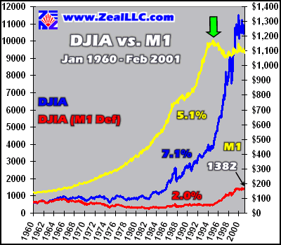
The next graph, using the same conventions as the previous one, deflates the DJIA with M1 growth. M1 is the narrow measure of US money supply, and many Austrian School economists believe it is what should be used to measure monetary inflation rates. In the following two graphs, the right scale is in BILLIONS of dollars…
In terms of M1, the Dow managed a DISMAL 2.0% real return over the last forty one years. The M1 deflated DJIA closed at 1382 in the final trading day of February 2001. With a 2% real return, it takes 36 YEARS to double one’s capital in constant purchasing power terms. Ouch! Inflation is dead? Equities are the best place for inflation? No way. If the greatest bull market in US history STILL only managed to exceed narrow money supply growth slightly and yield a paltry 2% real return, we shudder to think how poorly equities would do in real terms in normal periods of equity market history.
The inflection point on the M1 line above, marked by the green arrow, happened at EXACTLY the time the DJIA entered into its parabolic bubble blow-off stage. This may be because ordinary investors, seeing the massive anomalous returns on the Dow, begin to dump money into the equity markets to try and ride the exponential explosion in equity prices. This is also the time, around 1995, when the M3 money supply began to grow like a water balloon attached to a working fire hose.
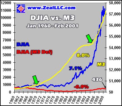
The DJIA in real terms as deflated by M3 is outlined in the final graph below. M3 is the broad money supply, and many economists believe it is the best proxy for true currency driven inflation in our modern complex economy…
If the first two graphs of real DJIA returns were ugly, this one is positively terrifying. In real terms as deflated by M3 growth rates, the DJIA yielded a NEGATIVE 0.9% real rate of return over four decades! The Fed recklessly grew the M3 money supply SO fast, at 8% compounded annually, that the poor DJIA couldn’t even keep up. In M3 terms, the DJIA slow-motion slumped from 622 in 1960 to 436 in February 2001. The long touted bullish myth that US equities stand up well to inflation, as properly defined by money supply growth, is shattered.
The first green arrow on the M3 line above is the 1971 date when the US money supply begin ballooning as the all-important stabilizing role of gold was cast off the US dollar. The new totally fiat US currency now had no real value. Its value only existed as long as people chose to believe in it. For all owners of the US dollar today, you gotta have faith! Sadly, FAITH alone in the promises printed on the inherently worthless piece of paper are all that make a dollar what it is today.
The second green arrow marks an amazing ballistic blow-off in the M3 money supply that occurred around 1995. This is also around the time M1 faltered and the time the Dow entered the terminal stages of its bubble. As fast as the Fed could create this extra money, at a rate which would double M3 every six or seven years, the US equity bubble eagerly absorbed it into its gaping maw, pushing equity prices far beyond fundamentals and into the stratosphere.
If, in the mega-chaos we see in the financial markets today, confidence in the US dollar is shaken, it could lose 50%+ of its value in mere days or weeks. The price of the dollar is helplessly dependent on international perceptions of its value. Inflation destroys confidence in a currency. There is nothing more dangerous to capital than an ever-inflating fiat currency. Ask any long-time Latin America investor and they will agree in a heartbeat that inflation is utterly lethal.
Obviously, since February the DJIA has dropped like a rock. What would the real returns have looked like at today’s Dow levels? In order to find out, we assumed a DJIA of 9000 at the end of March 2001. Using these assumptions, the DJIA would have a nominal rate of return of 6.7% since 1960, almost a half percent lower than our graphs above. In CPI terms, the REAL DJIA would have yielded a real return exceeding consumer inflation of only 2.1%. In M1 deflated real terms, Dow 9000 would only result in real 1.6% annually compounded gains.
In M3 deflated terms, the Dow at 9000, after holding for over FORTY years, would have granted investors a real 1.2% average annual compounded LOSS on capital. At that rate, after holding for four decades, an investor would have seen his or her capital cut by over one third! In for the long-term, eh?
The bottom line? Inflation MATTERS for ALL investors. Inflation is the single most dangerous macro-factor affecting investments over the long-term in countries with completely fiat currencies. The common Wall Street assertion being parroted by the shameless Wall Street promoters that there is no inflation in the US and that equities do well over time in inflationary environments is flat out wrong. The cheerleaders chanting this mantra on bubblevision are naive at best or intentionally deceptive at worst. Every one of these folks that goes on TV and claims inflation is either irrelevant or dead should be tied down to a chair, their eyelids taped open, and they should be forced to memorize graphs of the CPI, M1, M3, and US equity index performances over the last few decades.
Inflation IS real, it IS bad, it IS ugly, and it WILL chew investors up and spit them out. Whether in a totally virtual cyberspace world, or in real life, when the money supply increases faster than the goods and services available in an economy, inflation is ALWAYS the ultimate inevitable result.
Investors today with capital at risk in any US market must fully understand and prepare for the ravages of currency inflation. With the Fed increasingly telegraphing the fact it will inflate the US money supply as much as necessary to help the imploding US markets and economy, odds are that the inflation we see in the first decade of the new millennium will unfortunately dwarf the ugly precedents established since 1960.
Adam Hamilton, CPA March 23, 2001 Subscribe |
|||||||
|
|
|
|
|
|
|
|
|
|
|
|
|
|
|
|||